I'm fooling around with a new look for the blog.
Leave a comment if you like it or if it makes your brain bleed. (And let me know what browser you're using, especially if it looks hinky).
And be sure to check out the new "Labels" menu below the "Blog Archive" on the right. I went back and put labels on all the old blog posts. Now you can jump directly to all posts with audio, or all posts about recitals, etc.
Subscribe to:
Post Comments (Atom)


Kenneth,
ReplyDeleteWhen the "new look" came onto my screen, I heard myself say, "Ohhh" -right out loud. It's perfect! I like everything about it - the simplicity, the color, the keys, and the reflection.
Lucy
Good morning, Kenneth,
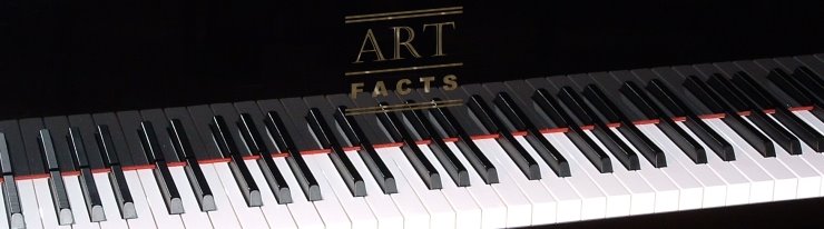
ReplyDeleteThe "new look" is really great. I've gone over completely to Google's Chrome and it handles your new format beautifully. Did you intend the "Art-Facts" text to overlap into the shadow of the keyboard. If you didn't, it does. It's fine, but it may detract from the "logo".
Dad
Ya, the logo/reflection thing was intentional. I tried different positions, but with the logo higher up and against solid black, the illusion that the logo is the fallboard inlay was weaker.
ReplyDeleteDear Kenneth,
ReplyDeleteI really love the new look. And also the text that goes with it.
Love, Mom